Case Study
Quinta do Sossego
Brand Identity & Digital Presence
Client
Quinta do Sossego
Industry
Hospitality & Lifestyle
Scope
Brand Strategy · Visual Identity · Web Design · Art Direction · Packaging
The Challenge
Quinta do Sossego needed a brand identity worthy of its setting, a private countryside retreat in the heart of the Alentejo. The brand had to balance refined hospitality, an investor ready story and the calm spirit of slow Mediterranean living.

Our Approach
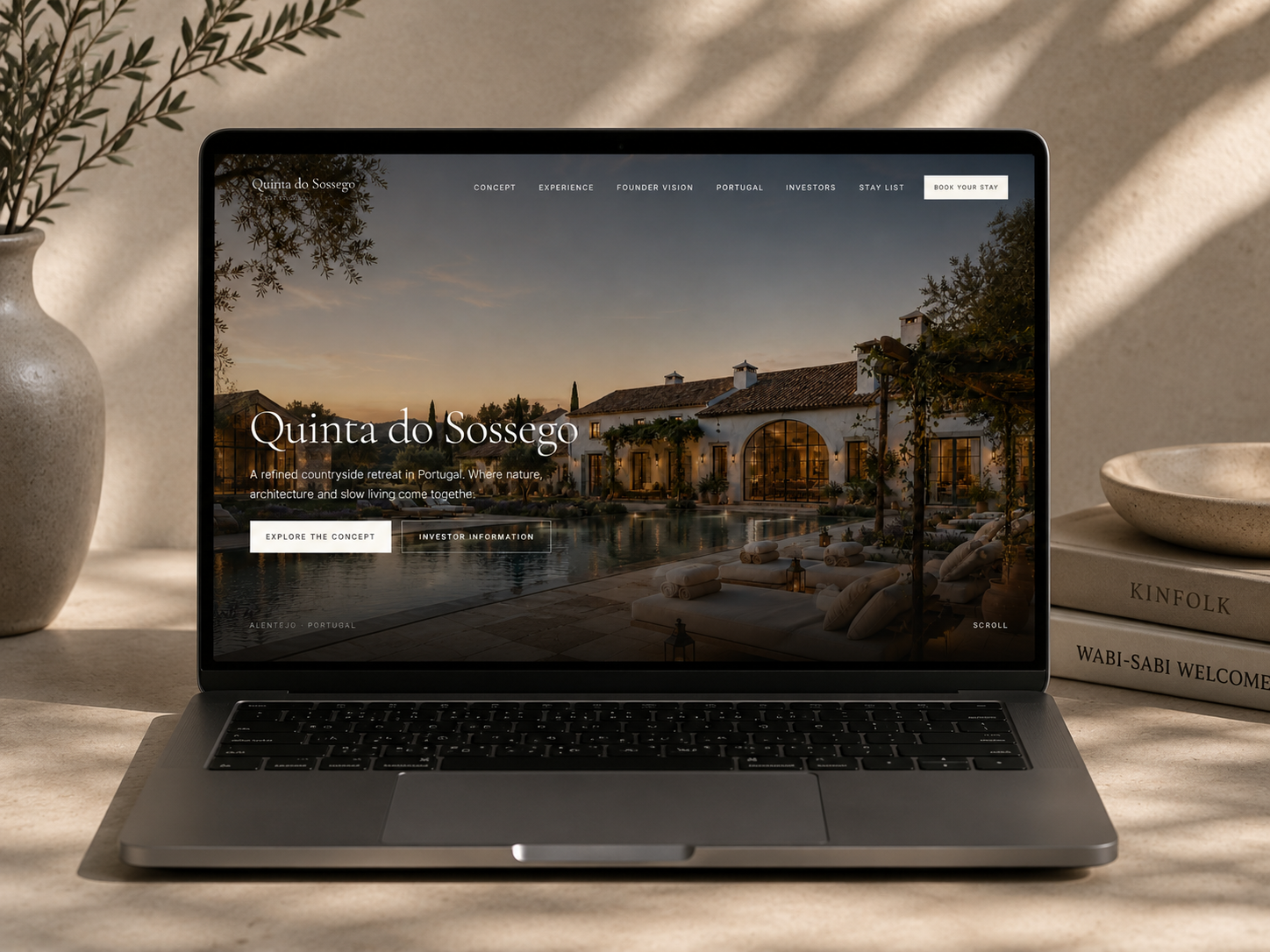
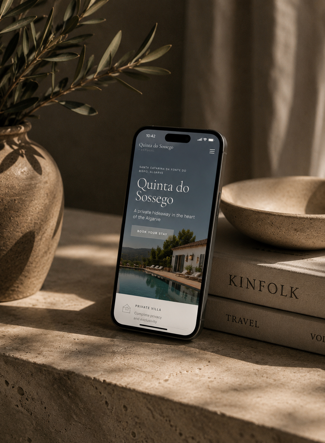
We built an identity rooted in place. Warm cream, deep Atlantic blue and considered serif typography, and translated it into an editorial digital experience that guides guests, investors and partners through the world of the Quinta.
From the website to the in villa wellness essentials, every detail is designed to feel quietly confident, deeply hospitable and unmistakably Portuguese.
- 01Brand positioning and strategy
- 02Visual identity and logo design
- 03Typography and color palette
- 04Editorial website design
- 05Art direction and photography
- 06Wellness essentials packaging
Wellness Essentials
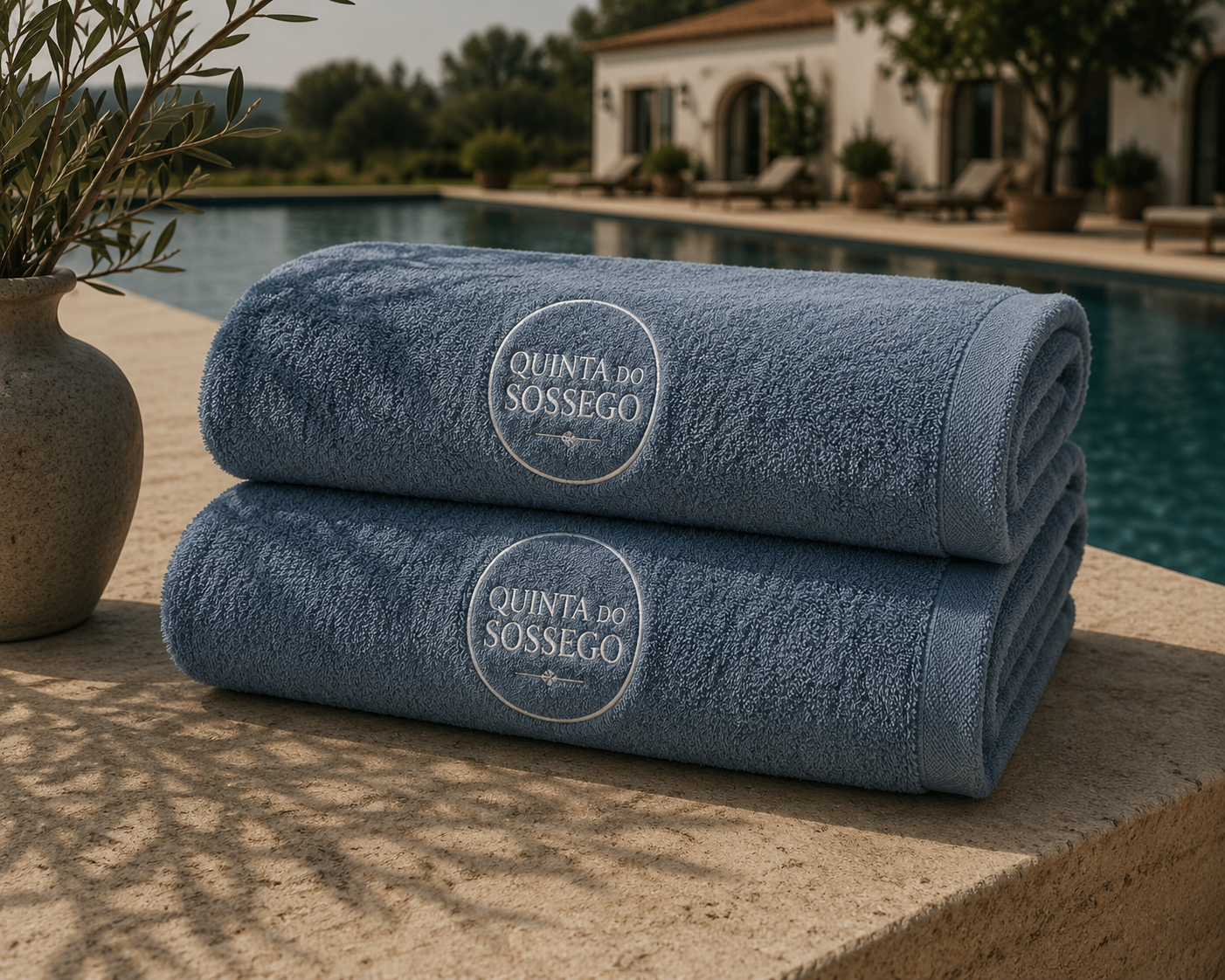
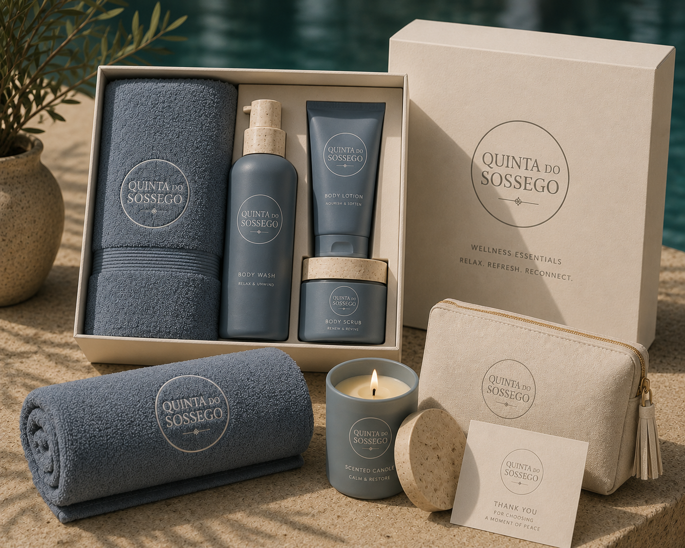
A custom line of in villa wellness products. Body wash, body lotion, scrub, candle and embroidered towels, packaged in calm slate blue and natural cream to extend the brand into every corner of the stay.
Results
- A distinctive, timeless identity rooted in place
- An editorial website that captures the spirit of slow living
- Consistent brand language across digital and physical touchpoints
- Premium packaging for the in villa wellness experience
- A confident foundation for investor and guest communication
Brand Keywords
“A private hideaway in the heart of the Alentejo, where nature, architecture and slow living come together.”
Website
www.quintadosossego.comAn editorial digital experience for a private countryside retreat in the Alentejo, guiding guests and investors through the concept, the experience and the place.